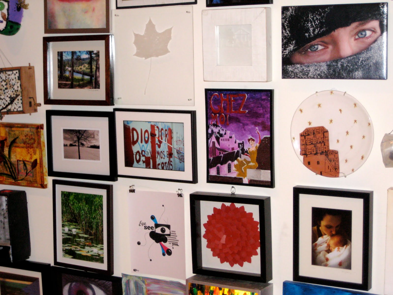
Finally, here they are. Some pictures from my trip to Philadelphia for the NCECA conference.
 At the clay studio - we found a floor to ceiling mosaic mural in the stairway done by local artist Isaiah Zagar.
 Walking around Fishtown, the neighborhood we stayed in.
It was Spring there! 70 degrees!
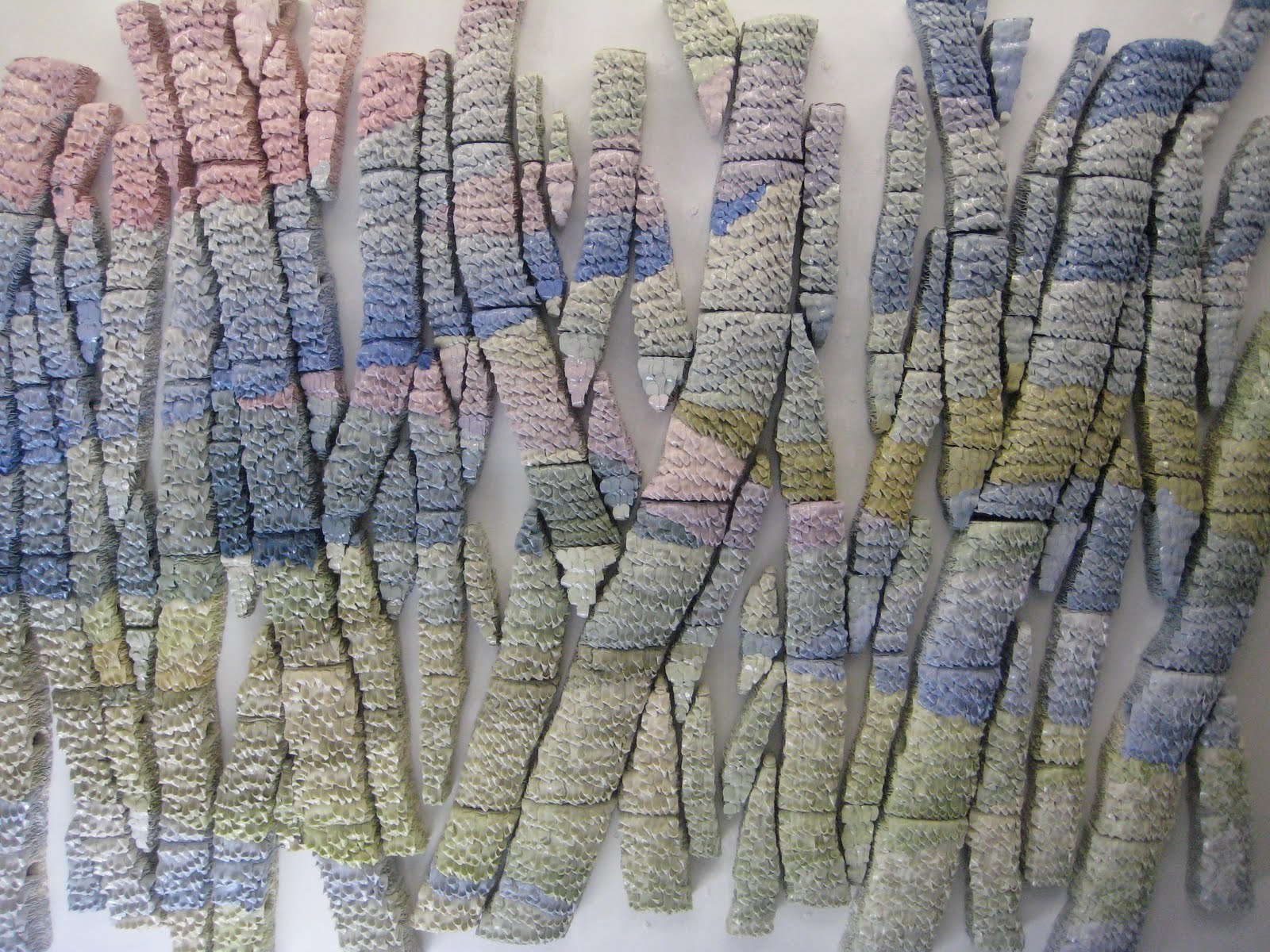
This is a piece by one of the resident artists at The Clay Studio. Her name is Myung Jin Choi, and we had the opportunity to meet her that day. Each little piece is about the thickness of a bandaid. The clay is colored, avoiding the need to glaze the final piece.

A close up of one of her pieces.
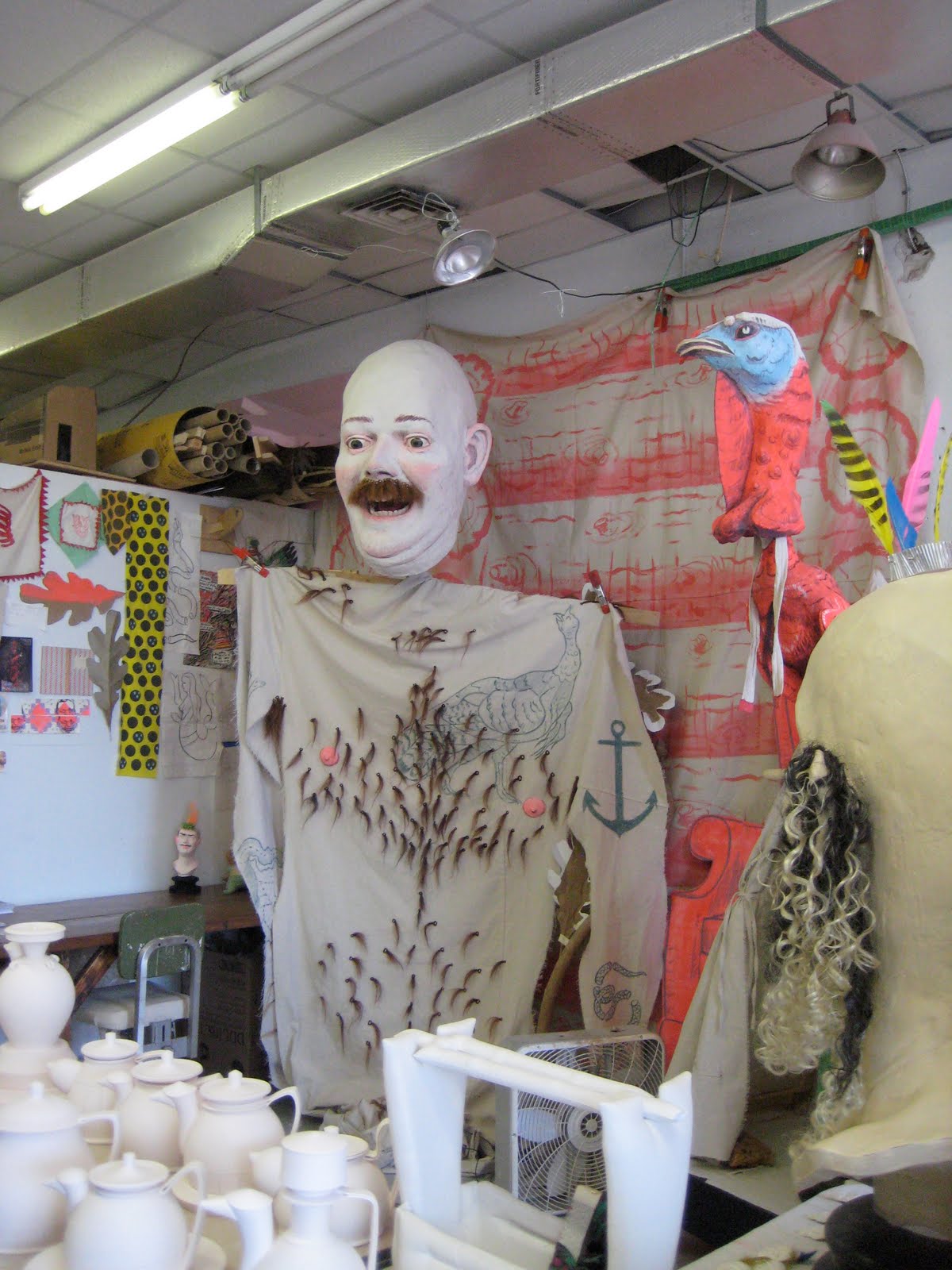 Another resident artist, Ryan Kelly.
 This street is right behind the clay studio, and is my new dream street. Its complete with a chair maker!
That's the apartment that I'm going to move to one day... Only $1500 for 2 bedrooms. Anyone want to chip in for the first month's rent?
 Opening Ceremony with keynote speaker Terry Gross from NPR's Fresh Air. She was super tiny and really silly. I'd highly recommend her program as well.
A shot of the Expo. The outsides had tables and tables of grad schools and the inner rows were filled with everything a potter could ever need in their studio. Glazes, ribs, trimming tools, etc.

INSANE.
 For two days of the conference, there were simultaneous demos given. Above is Kari Radasch and Richard Shaw, probably talking about decals. They took audience questions while doing the demos, and for some reason people enjoyed asking the same question about decals every 30 minutes. I know the saying goes, "There is no stupid question," but sitting in that room really made me question it. I did learn quite a few tips about handbuilding though. She uses an "applique" method where she adds a thin piece of clay to a leatherhard piece, and inspired me to add on some molecule appliques to my new work.
 Here's Kari's work at the La Mesa show.
Anna Metcaffe! She was my professor for a summer class, in which she taught me how to silkscreen decals similar to what are on these pieces.
 Urusla Hargens can be given full credit for teaching me how to properly throw. I love love love her work - it completely compliments her personality as well, which is part of the reason why its so great.
 Later on we went to the NCECA Invitational, Earth Matters. Above is a piece by Roxanne Jackson, a Minneapolis artist.
 Another one of Anna's pieces.
  Nan Smith
 I can't remember the artist's name, but this room was insane. The entire room was filled with this bug motif. In the center of the room stood a table which held a dinner set covered in the same design, sitting upon a hand-embroidered table cloth that matched the walls. To top it all off, we had to wear booties so our shoes wouldn't scuff up the floor. Insane.
 Grabbing some lunch outside the Reading Market.
 An exciting thing Philadelphia does to keep the art community thriving is First Fridays. On the first Friday of every month, studios and galleries in Old City stay open late to show off their new exhibition. Though you can't really tell from this picture, the streets were super packed with street performers, artists, and collectors alike.
  The Wexler Gallery was hosting two shows. Downstairs was Adelaide Paul's A Peaceable Queendom. She once used ceramic forms to cover with leather, but now I believe she uses taxidermy models.
 Upstairs, The Hermaphrodites was showing. From the website: The Hermaphrodites: Living In Two Worlds will focus on figural sculpture that both embodies the literal definition of hermaphrodites (encompassing both genders) and the conceptual nature of the term as it applies to sculpture that can be categorized equally as contemporary fine art sculpture or decorative art. The exhibition will concentrate on contemporary artists working with ceramics, who also adopt other processes, materials, and techniques commonly found outside of their discipline.
 Above is a piece by Dana Major Kanovitz. If you could get past how terribly creepy this sculpture was, the realism blew you away. I swear she must have taken real fingernails off of some cadaver somewhere to use on her hands.


At the Alfred Show.

Adrian Arleo's Dormant Honey Comb Horse. This is made of clay and wax encaustic. I'd love to see one of her demos...
More images from the remainder of NCECA and some sightseeing in Philly to come!